Giving Diversity a Home: The Corncockle
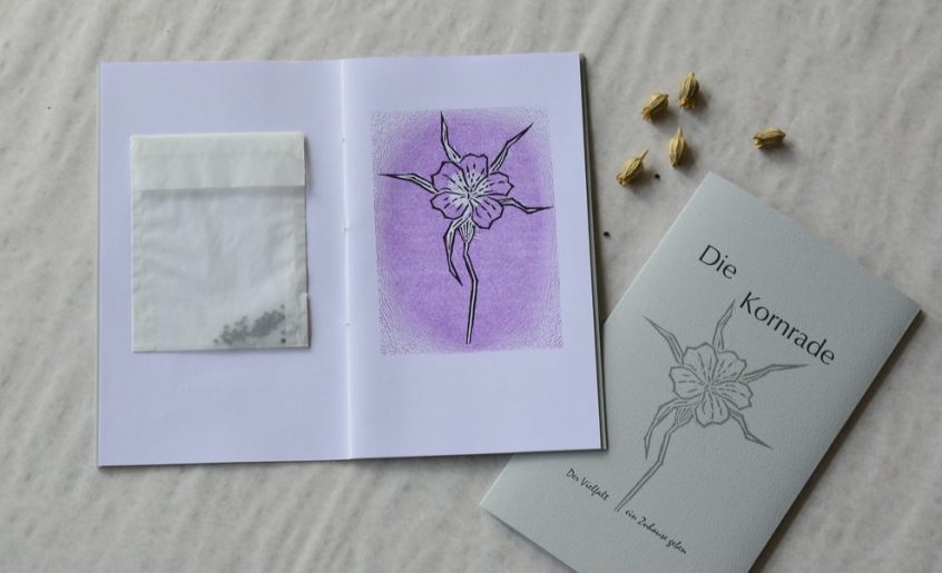
„Giving Diversity a Home!“ is the motto of a new series of small-size books and prints published in limited editions. All are printed letterpress with original prints e. g. linocuts. Every book title is a portrait of one species of either plant or animal, and aimes to help establish a „forever home“ for the respective species in our gardens. Some of the booklets will come with extras like letterpress printed labels for jams, chutneys and the like, or with sachets of seeds from our own garden.
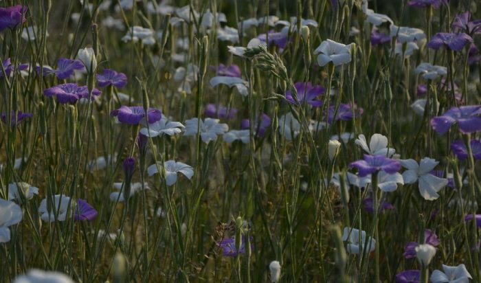
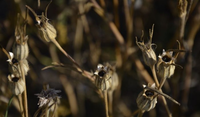
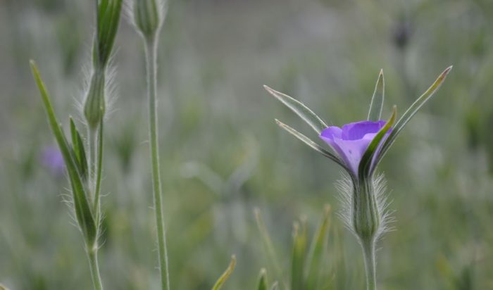
Corncockle is one of my favourites. It has been a constant ingredient, or rather weed, in growing cereals and known to farmers for as long as 5.000 years. It shows a stunning adaption to the cultivation of cereals. It is sown together with the cereals, it accompanies the cereals during harvesting and threshing and even milling. Corncockle seeds are poisonous, thus much effort was made to get rid of the weed that contaminated cereals, flour and in the end bread. Through seed cleaning and herbicides corncockle was driven to near extinction. In Germany it was almost extirpated in the 1990s, in Britain one single plant was found in 2014 in Sunderland.
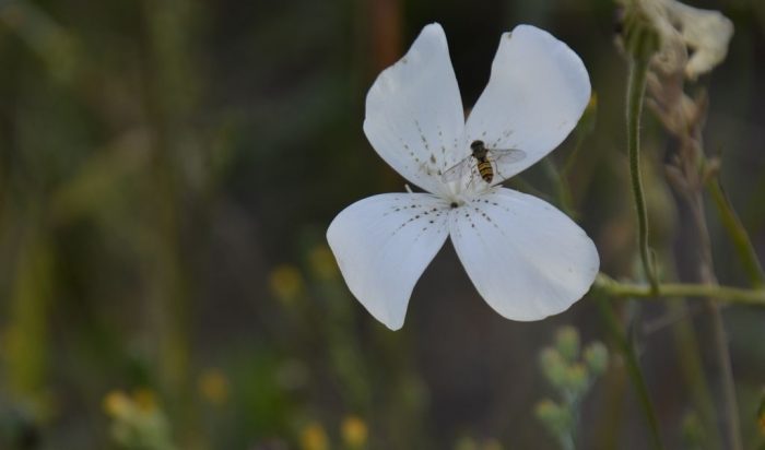
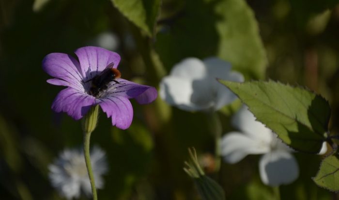
It is an anual plant that will germinate as soon as it is sown, just like seeds of cereals. Its purple flowers will be around all summer. It is valuable for a great variety of pollinators, among them hover flies. This and its ability to grow under dry condition make it a good choice for diversity gardeners. There is a white-flowering garden cultivar. The seeds are contained in a capsule which can easily be harvested and stored for next year‘s sowing.
The Illustrations
A two-colour linocut was designed and cut. For the title only the contour block was used, in the book the complete print from two blocks shows.
The Text
The chapters describe corncockle‘s history in agriculture and its use as garden beauty.
The cover comes with an old poem from Arabia.
The Typography
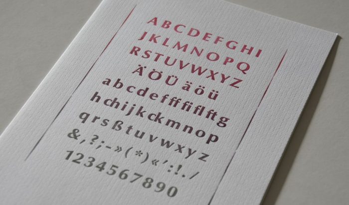
Corncockel is adapted to the traditional form of growing cereals in the best possible way, in one word: optimal. Thus Optima was the choice of metal type for this book. Designed by Hermann Zapf in 1958 for Stempel foundry it is still in use today.
The motto is set from Mistral, designed in 1954 by Roger Excoffon. The Arabic poem is set fromLegende, designed by Friedrich Ernst Hermann Schneidler in 1937. More on metal type at: A Place for Metal Type
The Material
For the inner pages I fell for Lönneberga Grön produced at Lessebo, Sweden, from recycled fibre with 100% green energy.
For the cover I chose Royal Sagitta, a paper that had been sitting on the shelves at the studio for more than 20 years. The last sheets now were used for the book about corncockle. The light grey resembles the hue of the fine long hairs on the plant when covered with dew in the mornings.
The Extras
Each volume comes with a sachet with seeds for sowing. The seeds were harvested from plants that have grown in our own garden in Oppenwehe.
Here come the naked facts about the book
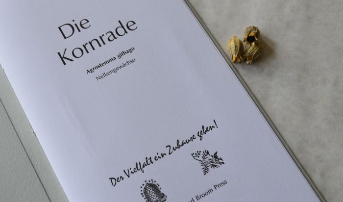
Die Kornrade – Volume 2 in the series „Giving Diversity a Home!“
Size: c. 150 x 250 mm
Cover: 8 pages, 4 pages printed letterpress, Royal Sagitta 250 gsm, grey
Pages: 8 pages, Lönneberga Grön 150 gsm white
Illustrations: two-colour linocut
Text: Annette C. Dißlin, handset from metal type, in German
Typefaces: Optima, Mistral for the motto, Legende for the poem
Press: printed letterpress on a hand operated Grafix proof press
Binding: pamphlet stitch with purple linen thread
Idea, design, linocut, text, hand-setting, printing, binding: Annette C. Dißlin
Edition: 45 numbered and signed copies
Publication: 2023 at The Fork and Broom Press, Oppenwehe
Prize: Euro 20.00