The Studio in 2012

It is the end of winter and I am driving my husband Günter to Westphalia, where he will be based for work from now on. He will live near Münster and we are up for a long distance relationship (500 kilometres), until a new home can be found. We will move house and studio, hopefully in the not too distant future, and I feel that there will be a good load of decluttering on the agenda at the studio.

Ten years ago the Schmausbuch was published as some form of specimen book, and since then a lot more metal type has made its way into the studio. Having that big relocation to prepare for is not the only good reason to take stock of and document the studio‘s metal type: thus the project “Meine Typen” (My Type) is born.
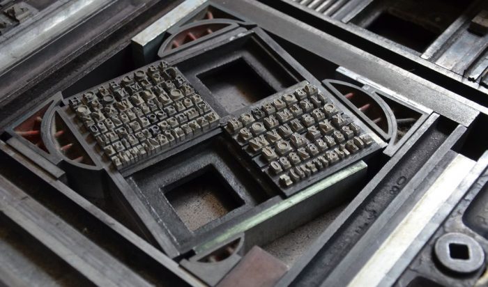
Some 100 typefaces will be depicted as alphabets on 4-page-A5 cards. Some will be adorned with ornaments, some will have a background image printed from various lino etchings. On the last of the four pages the name of the typeface, the year of publication and the name of the typedesigner are given. As paper to print on I choose a number of varieties from the Rives series, all 250gsm, made at Arjo Wiggins in Scotland. Each card will have no more than 40 copies. For the special exhibition at the studio, I print a poster and this is a lovely example of what can go wrong when working with metal type. One of the alphabets is the typeface Druckhaus. For the vowel mutation, the specimens so typical for the German language, the two dots on top, the umlaut for a, o und u, are placed on an enlargement of the specimen and it is cast like this. But with no support underneath they are prone to break off, which, in this case, is what happened somewhere during the print run.

To prevent this from happening, in other typefaces the umlauts have been integrated on the body of the specimen rather than projecting from it.

The Grafix proof press has finally made it to be my favourite equipment for printing text in the studio. It manages to print even tiny metal type flawlessly with the combination of motorised rollers and adjustable pressbed. Of course lino and wood blocks can be printed as well.
Students at the Technical College for Design are editing issue No. 9 of the students‘ magazine „format“. It will feature an article titled „The Unique Specimen in Typesetting and Typography“ and an interview with me along with some of the photos that Fabian took last year.
Every other year a new issue of the Artist‘s Book Yearbook (ABYB) is published. This year for the first time a selection of my works will be included. The yearbook‘s editor is Sarah Bodman, teaching at the University of the West of England (UWE) in Bristol.
Briefly noted:
Exhibiting at Druck&Buch in Erlangen
Exhibiting at Wasserschloss Klaffenbach near Chemnitz
„Bouquet Garni“: joined project with the magazine „Meine Landküche“
Published in 2012:
The series of alphabet-cards by the title „Meine Typen“
The series „Bouquet Garni“, 6 cards with herb recipes
The game „Wer hat Angst vorm langen s?“ is completed and a label printed for the wooden box –


Contact
for Druck&Buch in Erlangen alongside Poets Feast: Johannes Häfner
Artist‘s Book Yearbook (ABYB)


To be continued on 14 May 2024


Just lovely Annette. These blog posting are a delight to read.