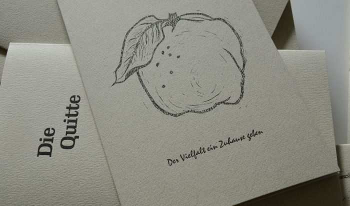
Giving Diversity a Home: The Quince
„Giving Diversity a Home!“ is the motto of a new series of small-size books and prints published in limited editions. All are printed letterpress with original prints e. g. linocuts. Every book title is a portrait of one species of either plant or animal, and aimes to help establish a „forever home“ for the respective species in our gardens. Some of the booklets will come with extras like letterpress printed labels for jams, chutneys and the like, or with sachets of seeds from our own garden.
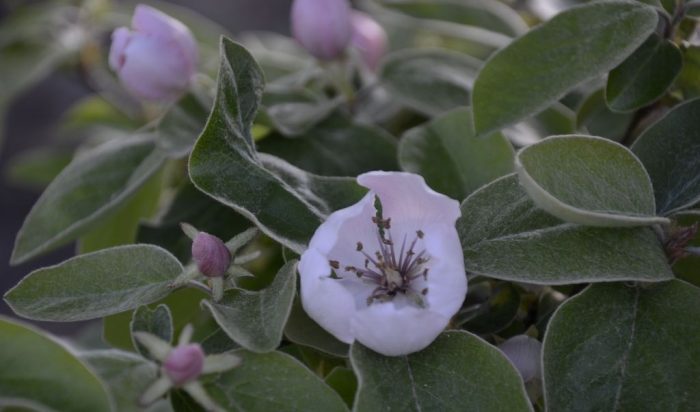
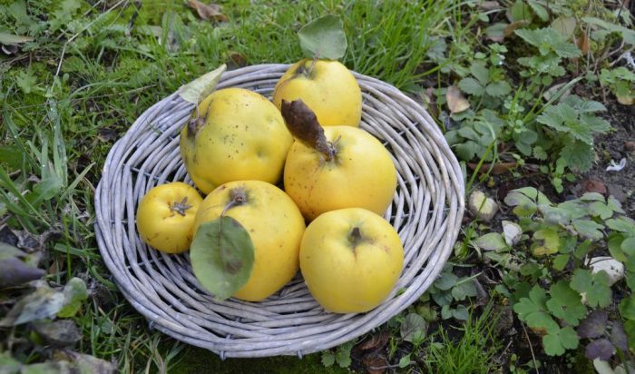
Since we moved here in 2016 we have planted seven Quinces. The tree, left to grow in his own characteristic way, makes a lovely eye catcher in a garden. In late May its flowers turn it into a cloud of white with a little pink at the beginning, in late summer the huge yellow fruit give a feel of abundance and in autumn the leaves will make the whole tree glow golden. The flowers come with both, nectar and pollen, thus are a good source of food for many pollinators. The fruit can be used for jam, chutneys, curry dishes and juice.
The Quince is an old lady in the family of fruit trees and dates back to as far as 600 BCE. In the Middle Ages it was more than common in Britain, but over time apple and pear were preferred. However, the quince tree can cope better with a shortage of rain than does its cousin apple, and quinces can be stored far longer than the fruit of their other cousins pear. Add to this: in the kitchen quinces are more versatile than are pears.
With so many good reasons the Quince was the choice for the first volume in the new series.
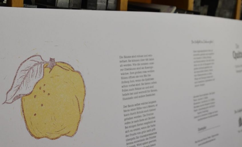
The Illustrations
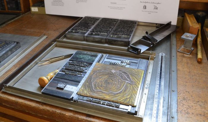
A two-colour linocut was designed and cut. For the title only the contour block was used, in the book the complete print from two blocks shows.
The Text
The chapters describe the Quince in the garden, in the kitchen and in a recipe for fruity Quince chutney.
The cover comes with an aphorism from Li Gi „The Book of Customs“, c. 160 BCE.
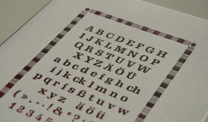
The Typography
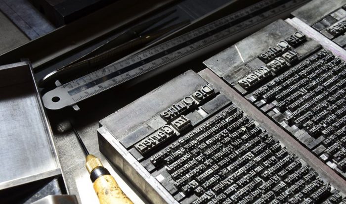
This time choosing type was easy. Georg Trump (1896-1985), who was a student with Prof. Ernst Schneidler, designed Schadow Antiqua between 1938 and 1952 for Weber typefoundry in Stuttgart. He chose to vary the form of the letter Q in the different styles of Schadow Antiqua, i. e. italic, book and bold. So Schadow was the type face of choice for the book about the Quince.
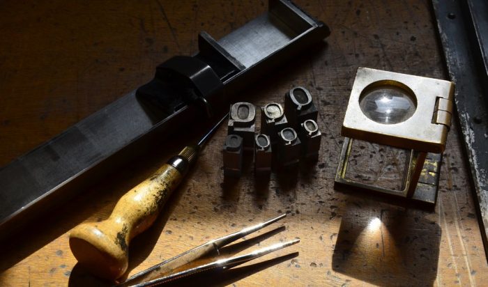
The motto is set from Mistral by Roger Excoffon. The aphorism is set from Present by Friedrich Karl Sallwey. More on metal type at: A Place for Metal Type
The Material
For the inner pages I fell for Lönneberga Grön produced at Lessebo, Sweden, from recycled fibre with 100% green energy.
For the cover I chose Royal Sagitta, a paper that had been sitting on the shelves at the studio for more than 20 years. The last sheets now were used for the book abput the Quince. Their lovely shade of quince yellow made them the perfect choice.
The Extras
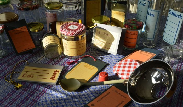
Each volume comes with a sachet containing three labels, one each for jam/marmalade, chutney and jelly. The labels are printed letterpress on gummed paper. It will stick when moistened, and can be removed by moistening again.

Gummed paper is a classic and was used as a standard for stamps for ages. The back of the paper is fitted with glue made from gum arabic, a substance harvested from certain acacia trees. It is used in the manufacturing of ink, food and pills amongst others. When moistened it will stick to glass and paper and many other surfaces. From glass jars it can be removed 100% by just moisturing it again. Thus the jar can be cleaned and re-filled, the label is pure paper waste. No plastics, no foil, no smears of glue.
Here come the naked facts about the book
The Quince – Volume 1 in the series „Giving Diversity a Home!“
Size: c. 150 x 250 mm
Cover: 8 pages, 4 pages printed letterpress, Royal Sagitta 250 gsm, yellow
Pages: 8 pages, Lönneberga Grön 150 gsm white
Illustrations: two-colour linocut
Text: Annette C. Dißlin, handset from metal type
Typefaces: Schadow Antiqua in variations, Mistral for the motto, Present for the aphorism
Press: printed letterpress on a hand operated Grafix proof press
Binding: pamphlet stitch
Idea, design, linocut, text, hand-setting, printing, binding: Annette C. Dißlin
Edition: 45 numbered and signed copies
Publication: 2023 at The Fork and Broom Press, Oppenwehe
Prize: Euro 20.00


Just marvelous. M xx
[…] „Die Quitte“, artist‘s book, colour linocut […]