Giving Diversity a Home: The True Medlar
„Giving Diversity a Home!“ is the motto of a new series of small-size books and prints published in limited editions. All are printed letterpress with original prints e. g. linocuts. Every book title is a portrait of one species of either plant or animal, and aimes to help establish a „forever home“ for the respective species in our gardens. Some of the booklets will come with extras like letterpress printed labels for jams, chutneys and the like, or with sachets of seeds from our own garden.
When we moved here in 2016 one of the first trees we planted was a medlar tree. I came across my first medlar way back in the 1980s somewhere out in a vast meadow not far from Steinhuder Meer. I was spellbound instantly. The small tree to me looked like a wise and aged sorcerer, bent down from age and in the quest for finding a magic herb.
On one occasion at a nursery we came across three trees of the original wild variety, which sports thorny branches and small fruit. They are now settling in and giving good company to the two cultivars which bear large fruit – and do not have thorns.
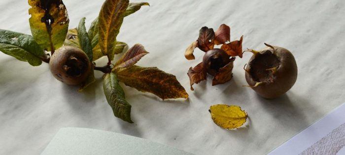
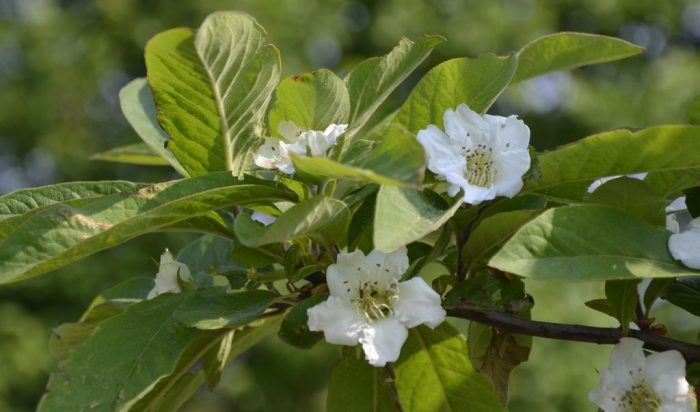
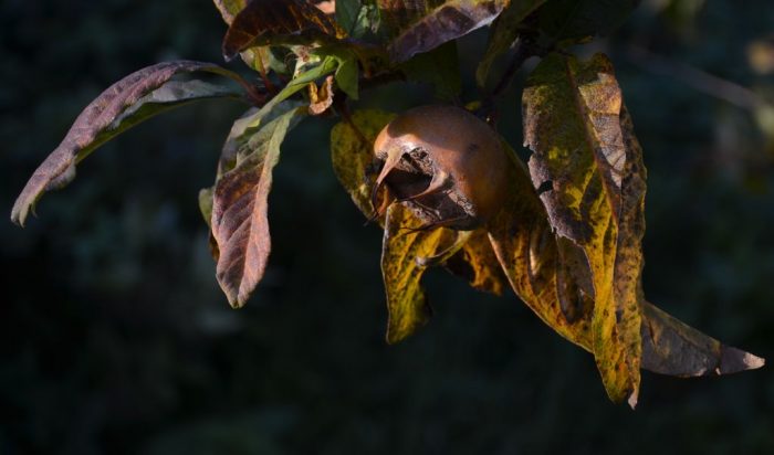
The trees have their very own way of growing. Their crown will grow broader than high. Medlars bloom in mid or late May. Depending on the region they might be affected by late frost, but in mild regions they will be fine. The flowers are big and white with five petals – like in all members of the rose family. Their roots go deep and once settled in at a place they can withstand dry periods. They are robust and do not need pruning. Their fruit ripe in late autumn. Once ripe they go soft and can be made into a delicious jelly.
Medlars used to be a staple on farms, but have become neglected and almost forgotten. Nowadays they are valuable for species diversity and can cope well with water shortages.
The Illustrations
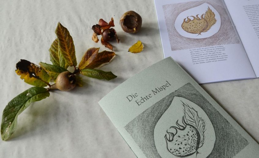
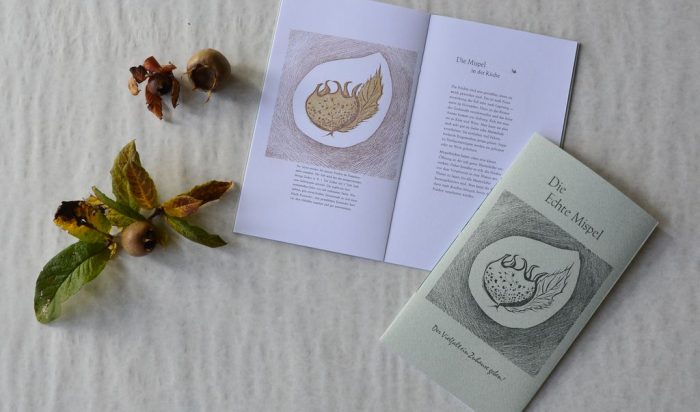
A two-colour linocut of the fruit was designed and cut. For the title only the contour block was used, in the book the complete print from two blocks shows.
The Text
The chapters describe the medlar as part of the landscape, as valuable member of the diversity-garden and in the kitchen. There is a recipe for how to make medlar jelly.
The cover comes with an aphorism of the magician and philosopher Liä Dsi (480-400 BC).
The typography
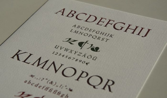
With medlar being an almost ancient fruit tree my choice of metal type was Trajanus. The type cabinet in which the type is stored is one of the oldest I have. It is quite battered. This Trajanus type quite obviously has been much used. It seems to have been the bread&butter type in its former printing office. It was traded by the Stempel foundry and designed by Warren Chapell (1904-1991) who was taught by Rudolf Koch in the early 1930s. Trajanus comes with lovely ornaments one of them resembling the Aldus-leaf.
The motto is set from Mistral designed by Roger Excoffon in 1954. The aphorism is set from TimeScript by Georg Trump. More on metal type at: A Place for Metal Type
The Material
For the inner pages Lönneberga Grön 150gsm is used – it is produced at Lessebo, Sweden, from recycled fibre with 100% green energy.
For the cover I chose Tintoretto melange 250gsm produced by Fedrigoni, a paper that had been sitting on the shelves at the studio for many years. When this paper was first published it was produced containing silk fibres. The shade merino is a charming hue of green.
The Extras
Each volume comes with a sachet containing two labels, one each for jam/marmalade and jelly. The labels are printed letterpress on gummed paper. It will stick when moistered, and can be removed by moistering again.
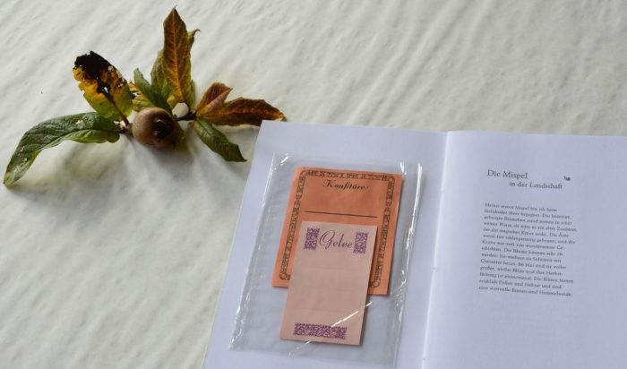
Gummed paper is a classic and was used as a standard for stamps for ages. The back of the paper is fitted with glue made from gum arabic, a substance harvested from certain acacia trees. It is used in the manufacturing of ink, food and pills amongst others. When moistered it will stick to glass and paper and many other surfaces. From glass jars it can be removed 100% by just moisturing it again. Thus the jar can be cleaned and re-filled, the label is pure paper waste. No plastics, no foil, no smears of glue.
Here come the naked facts about the book
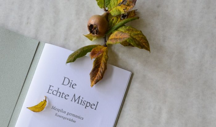
The True Medlar – Volume 3 in the series „Giving Diversity a Home!“
Size: c. 150 x 250 mm
Cover: 8 pages, 4 pages printed letterpress, Tintoretto melange 250 gsm, merino (green)
Pages: 8 pages, Lönneberga Grön 150 gsm white
Illustrations: two-colour linocut
Text: Annette C. Dißlin, handset from metal type, in German
Typefaces: Trajanus, Mistral for the motto, TimeScript for the aphorism
Press: printed letterpress on a hand operated Grafix proof press
Binding: pamphlet stitch with green linen thread
Idea, design, linocut, text, hand-setting, printing, binding: Annette C. Dißlin
Edition: 45 numbered and signed copies
Publication: 2023 at The Fork and Broom Press, Oppenwehe
Prize: Euro 20.00

