The Compositor is a Gardener
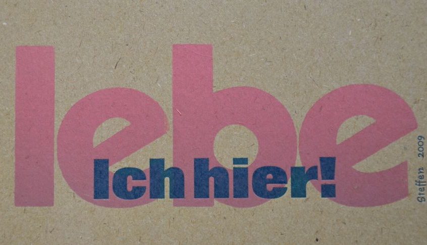
and Typography is Interpretation.
The gardener plants trees and shrubs, perennials and summer flowers, giving each their respective placing, so every single one can have their specific effect over the course of the year. He makes a strictly planned garden come into existence with straight lines and borders, or a romantic garden with curving edges flowing into bespoke corners. He creates a functional bed that can be weeded easily and will produce a crop of fruit and vegetables, or he allows a great diversity of species to each find their respective spot to thrive. Starting with an idea the gardener creates something whole, a context that has not existed before, which is more than the sum of its elements.
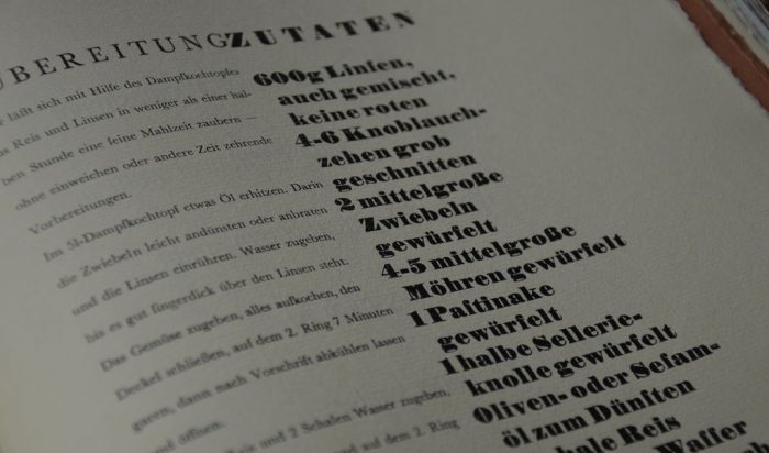
Basically the work of the compositor is quite similar to that of the gardener. When taking up letterpress and printing I encountered one book early on „Das Setzerleherbuch“ (Compositor‘s Textbook) by Josef Käufer. It was published in the 1950s. He desribes typography as the art of arranging metal type to make a textblock.
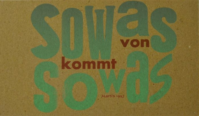
He writes:
„Setting type means to assign rank and placing to a typeface in its manifestation, choosing it bigger or smaller, heavier or lighter, group it or isolate it, in general take all measures to turn the manuscript, that comes with a low level of order, in a text of a higher level of order thus gifting it with the proper legibility.“
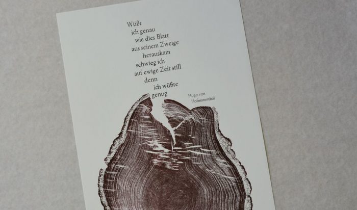
For a long time good legibility was paramount in the work of the compositor. This was not limited to clear letter form and a clean print. An important part was a typography, that created accentuation and gave the option to pause while reading, that put rhythm and tune to the pure text, that would keep up with the speed of the story and accompany the reader, giving them a hand in difficult places and let them catch their breath during the easier passages. This is when typography grows into interpreting the text, allowing the structure of the content to become visible.

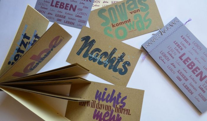
Obviously art can take typography further, even resulting in legibility becoming harder, and by doing so forcing the reader into genuine reading. In this case, too, typography takes the reader by the hand leading them. However, this time typogtaphy demands the reader to look properly, to even look twice. It requests them to read in the true sense, and not just think they can guess on first sight what the text, most likely, might say. With this idea in mind I create the artist‘s book „Meine Worte fallen wie Steine“ (My Words Fall Like Stones) in 2014.
For reading:
Josef Käufer „Das Setzerlehrbuch – Die Grundlagen des Schriftsatzes und seiner Gestaltung“ Otto Blersch Verlag, 1956, Stuttgart.
Walter Mehnert „Die Gehilfenprüfung als Schriftsetzer – praktisches Arbeiten, Fachkunde in Fragen und Antworten, Fachrechnen in Aufgaben und Lösungen“ Otto Blersch Verlag, 1961, Stuttgart.
Leo Davidshofer, Walter Zerbe „Satztechnik und Gestaltung“ Schweizerisches Fach- und Lehrbuch für Schriftsetzer, 2. Aufl. 1952, Hg. Bildungsverband Schweizerischer Buchdrucker, Bern.
Essay „Mit Kopfrechnen zum Textblock: Handsatz aus Bleischriften“
More books on the topic and some English ones, too, at bleiklötzle
Contact
Supplies for printers and compositors from Drucken und Lernen
To be continued on 3 April 2024


Now this was a surprise little interlude in the Journey. This blog post works really well with the other text and introduces the garden and diversity theme beautifully. Chapeau!!!
Thanks, Marianne. Lovely you like the little surprise. Annette