The Studio in 2005
A publishing house/printing office is giving up some of their type cabinets and metal type, in order to make space for a hightech printing machine.
Gradually the new place is filling up. I go round measuring, and, yes, with a little reshuffling it can be done.
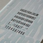
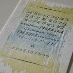
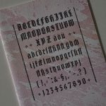
Two members of staff transport the eight type cabinets to my place in a lorry fitted with cargo-lift. This is genuine luxury, because with my van it would have to been necessary to pick up the cabinets one by one. Amongst the cabinets is a very old one containing various sizes of the typeface Trajanus. This must have been the bread&butter type since it looks worn and battered. However, it is still fit for work, prints nicely and quickly becomes my favourite. Also on board are Olympia and Semper.
The first student comes to stay at the studio. Susanne will be with me for two weeks. She has completed school and wishes to become a bookbinder. While at my place she will make two books, and try out linocut, working with metal type and letterpress printing. A few years later she‘ll come to visit bringing her mates from school, all of them are currently apprentices in the craft of bookbinding.
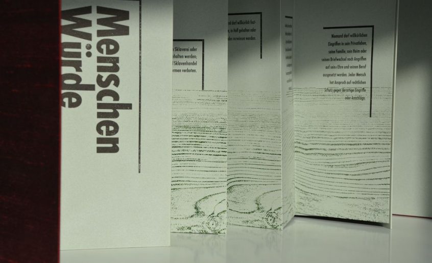
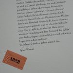
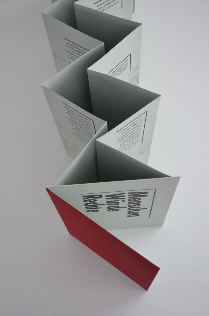
Human Rights has been a field of interest in my work before, as in the broadsheet printed in 2001 referring to 11 September, and the artist‘s book on the speech by Count Mirabeau on tolerating different religions, published in 2003. Human Rights will remain a constant in my work as an artist and will come in a number of forms over the years. In 2005 the artist‘s book „MenschenWürdeRechte“ is published. It comes with a choice of 16 of the articles from the Declaration of Human Rights. As background the woodgrain of a weathered plank is burnished in green, the colour of hope. Woodgrain is how time manifests itself materially in the form of the rings a tree builds year after year, making time visible, symbolizing that Human Rights hold true over time. For the text Futura is chosen as metal type, because this is the typeface that, like no other, lets the textual content have the centre stage while itself visually remaining in the background. The book is made as a twin concertina book. It is built in a way that allows its pages to be turned in an endless circle. This is a symbol of the Human Rights having neither beginning nor end. The cover is made from red silk, being one of the most precious fabrics and red the colour of Souvreignity and the High Court.
Briefly noted:
Learning Japanese Bookbinding with master bookbinder Anke Metz at Buchbinder-Colleg
Published in 2005:
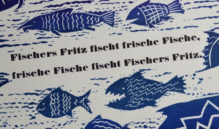
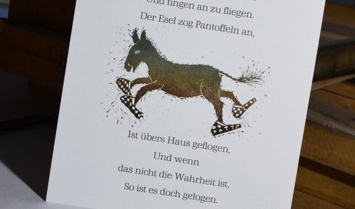
Nursery rhymes to show that as a kid you can have fun with reading.
„Menschen Würde Rechte“ – artist‘s book, twin-concertina
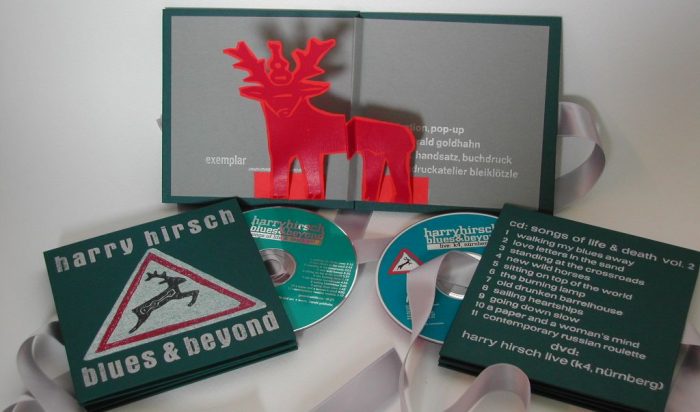
„Blues and Beyond“ – Booklet with Pop-up, collaboration with Harry Hirsch
Collaboration: Der Drucktopf
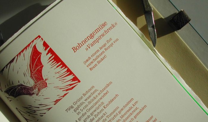
Every other year Christa and Klaus-Uwe Heinrich publish their „Drucktopf“ at Minipressenmesse in Mainz. There are basically no restrictions as to the contribution as long as it is a cookable recipe and fits with the size and function of a book (it must be possible to turn the pages). From 2005 on my contributions will be Beans to shoo off vampires, dogbiscuit, Cock-a-Leekie and carroway soup. In the books, prints can be taken out individually, and each volume has another sort of inventive clasp. In 2009 the pair of publishers were given the Minipressen Messe Award for the project. The series has since been closed.
Contact
Workshops at Buchbinder-Colleg
To be continued on 18 April 2024


I’d love to try the Vampirschreck dish. Blog posting is beautifully presented.
It has got a LOT of garlic in it – never had any vampire issues ever since. x A
The Lino cut tongue twisters look amazing. Very talented Annette!!
Thank you, Sue! These prints were so much fun to make!