The Studio in 1999
The 20th century is on its last legs and nearing its end. Letterpress printing using movable type came into use proper by the end of the 15th century – greatly helped by Johannes Gutenberg. During the 1970s it quickly lost its dominance. New printing techniques were quicker, did not need as much space and would involve less staff.
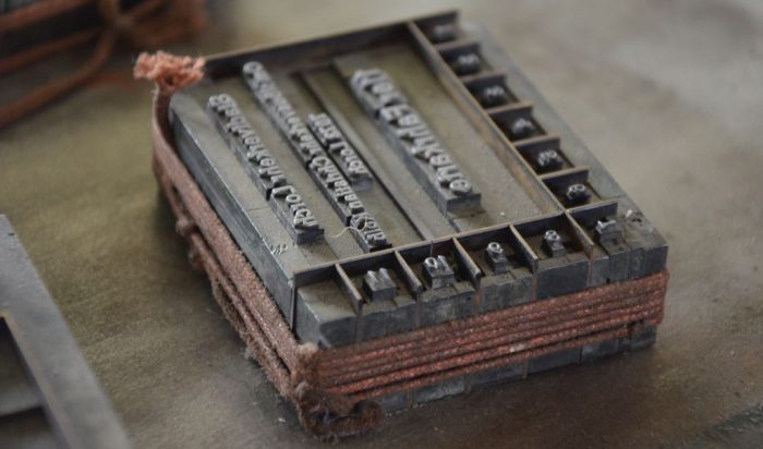
Being able to work with metal type efficiently, requires a full stock of specimens, in sufficient quantities for all typefaces needed – ready to use at all times. This also applies for all the different sizes as well. Add to this there is the need for a wide variety of spacing and “furniture”. These are necessary to produce the spaces between words or lines, and to fix the form in the pressbed.
For my first print I need to saw to size small wooden planks since I do not have the “furniture” I need. Quickly it becomes apparent that I need more spacing and furniture. And a few more typefaces or fonts wouldn‘t be bad either. Cases arrive carrying Memphis, as a slab serif, Arkona, as a script+brush, and Lucian, for something a bit special. You can, of course, pile cases on top of each other, but they are difficult to work with this way. There is no denying it: I needed a type cabinet.
Frankly, it does not look like there is enough space in my rooms for this, but with more reshuffling a sufficient spot could be created.
At that time Letternservice Ingolstadt is still operational. It is the sales department of the Wagner foundry, which currently is closing down. I am able to secure newly cast Hiero Rhode, Garamond, Post-Fraktur and Kabinettfraktur, plus a used type cabinet in good shape with its cases all empty – in which all my metal type now goes.
I receive word about metal type and letterpress equipment to be had from a former photographic studio. The lot is stored away in a shed. The late photographer had been running a quasi-publishing house for postcards, produced from his photos with information printed on the back using a Heidelberg Windmill platen press. He produced picture postcards or autograph cards depicting popstars from the 1950s. Once he had set the texts he would keep them for further editions. Since he was never trained as a compositor, he could not properly secure the text blocks.
Instead he stuck sellotype around them, which he put underneath as well. The glue used would develop over the years into an awkward mess. By storing the type and not distributing it, he gradually ran out of type resulting in him needing to order new type from the foundry. Over time some four similar but slightly different typefaces mixed in the type cases. Even after meticulous sorting, the type had to be declared not useable. Amongst the type which could be worked with were Savoy and Florida. One of the type cabinets was rather special in that it was an unusual build, but it also displayed an unusual fate. The photographer was a heavy smoker and the cabinet still showed the signs of a violent explosion that must have happened at some time. There was also a manual device for producing a groove, which needed some maintanence to be put back into good working order. Just weeks after we had picked up the equipment storm Lothar ripped open the shed. A few years later storm Jeanett would get even closer while we were picking up type.
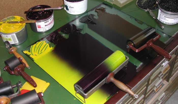
During printing, it becomes obvious that the rollers had aged and needed new coating, but with money in short supply this had to be postponed. Thus all prints needed to be inked with hand rollers. This is fine with woodcuts and linocuts. However, there are limitations when working with metal type. Type smaller than 16pt is problematic in that it quickly takes up too much ink. Over the years and with a lot of practice you can get the right feel for the appropriate amount of ink. However, working with type of 12pt or 10pt still remains challenging.
Nevertheless, all work printed up to 2006 has been inked using hand rollers.
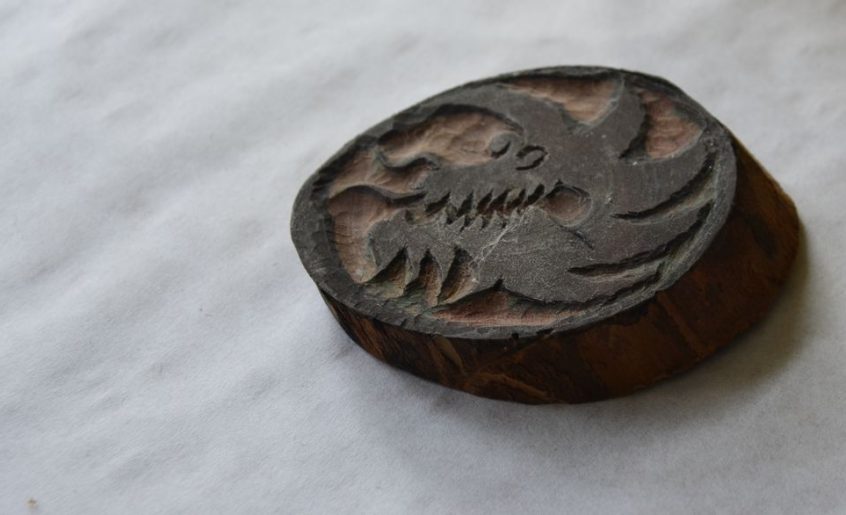
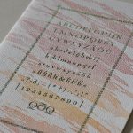
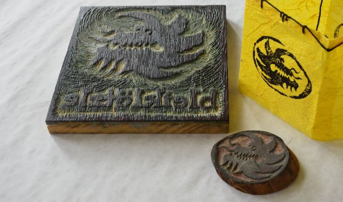
This year studio is given its name and a logo image to go with it. The name I choose is bleikloetzle, preferably handset from Genzsch-Antiqua, and a happy dragon is the image. Initially, this is cut into a slice of a branch and burnished onto paper. Later there will be variations made with wood blocks to be printed on the press.
Briefly noted:
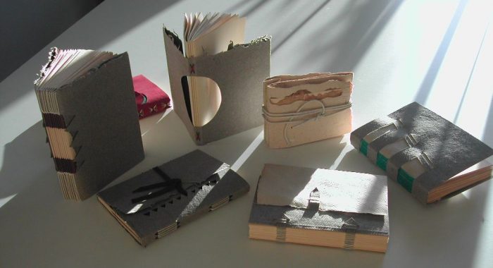
I sign in to „Historical and special bookbinding techniques“ a professional course with master bookbinder Anke Metz
A van becomes member of the team: an old Ford Transit.
A drying rack becomes member of the team.
A guillotine becomes member of the team: a Krause 1913 with a wooden table.
A paper cutter becomes member of the team.
For reading
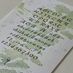
Georg Kandler: Alphabete – Erinnerungen an den Bleisatz. 1995, Minner-Verlag, Kornwestheim.
To be continued on 21 march 2024


Hello Annette,
Installment No. 2 done and dusted. Well done!! Great photographs