The Studio in 2001
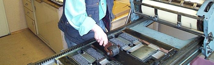
Over the period from 2001 to 2003 my husband and I will be casting three typefaces on Heiner Buser‘s Monotype machines at his Greno printing office. The first to be cast is 10pt Baskerville. Casting type ourselves comes with the option of having a greater amount of type on stock – for longer texts, that is for books. The font list says how many of each specimen needs to be cast for any given language in order to reasonably work with that type in the respective language. We decide not to keep with this list for two reasons. Heiner tells us that we shall need more of the numerals 2 and 0, since we have entered the 21st century. Plus, if we want to use the type with English text, we also need to adjust the numbers of lower case y, h, t and o.
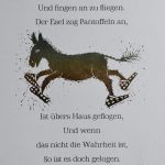
Baskerville is to be the typeface used for the first artist‘s book. This will be a challenge since it is a 10pt and I still need to ink with hand rollers. The text is a bedtime story. I had written it in 1986 for my goddaughter, after I had been hit by an impressive hailstorm in the north of Swedish Lappland. I had been with a group of students on a field course and we got drenched to the bone. Even next morning our clothes were still wet and cold and stiff – we had to kind of walk them dry on the way.
The title of the story is “Little Niak” referring to the 2.000 metre mountain Nijak in Sarek National Park, where we had the encounter with the hailstorm. Little Niak is the one cooking up our weather, a procedure that doesn‘t always go to plan.
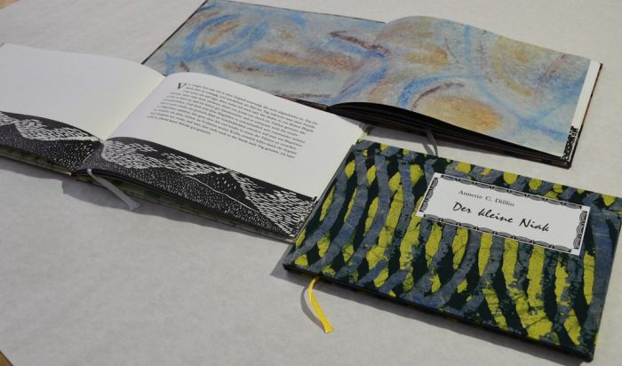
Five woodcuts are used for illustrations. Endpapers are coloured papers, handmade to match the cover variations. For the variations different fabric is used, the special edition comes in African hand-printed batik fabric. This first work is presented later that year at the 16th Minipressenmesse (book fair) in Mainz.
A bookbinder is closing down his workplace due to old age. We can pick up a type cabinet and a rather old rotating stool. This way the studio can add one of its favourite sans serif typefaces to the collection: Futura condensed-light. And while trying to pull out a handplaten press that is mounted on some stool, my husband Guenter suffers a slipped disc, which will pester him for years.
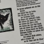
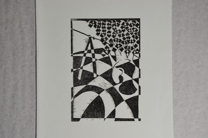
A first portfolio is made with the title „Lushin“, an attempt to combine woodcut and cubism. This is not an easy task, since cubism, as we know it from the works of Braque and Picasso, originally developed from painting, and there is no easy way to transfer its characteristic style into classical woodcut. Vladimir Nabokov in his novel „Lushin“ tells of a chess genius who gradually looses his mind. Along this theme both the woodcuts and the typography of the texts become gradually more strange. The six images show each figure of the chess game in a selected situation from the life of Lushin, separate text sheets carry the respective passage from the novel. All sheets are in a portfolio made from deckled edge paper, held together firmly by a black satin ribbon and a ring from snowflake obsidian. The whole work is almost entirely black and white, like a chessboard.
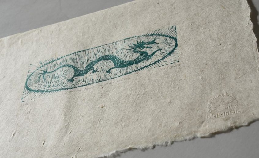
There is one more piece of literature that is turned into a print. A particular book by D. H. Lawrence fascinated me when I read it in the 1980s. It was the last book D. H. Lawrence wrote before he died in 1930 und its title is „Apocalypse“. In this work he described his vision of the joy of living in unison with the cosmos. I made a delicate woodcut of a green dragon, which is the cosmic dragon in its posive aspect, giving life. D. H. Lawrence writes on the green dragon, „when he stirs green on a pure dark night of stars it is he who makes the wonder of the night, it is the full rich coiling of his folds which makes the heavens sumptuously serene“.
Briefly noted
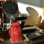
Spare parts need to be ordered from Caslon, London, for the Adana
The studio’s website is online on www.bleikloetzle.de
First trials working with earthen pigments are made.
Exhibiting at 16th Minipressenmesse in Mainz
Works published in 2001
„der die Nacht wunderbar macht“ woodcut, homage to D. H. Lawrence‘s last work „Apocalypse“
„Gelbe Schöne“, woodcut from 4 blocks
„Elfter September“ broadsheet, woodcut from 2 blocks
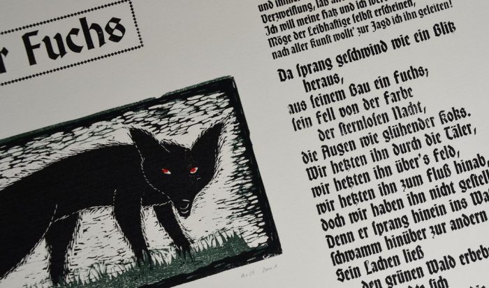
„Der Fuchs“, broadsheet, folksong, woodcut from 3 blocks
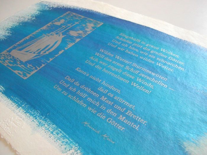
„Sturmeswüten“, poem by Heinrich Heine, woodcut, sheets painted
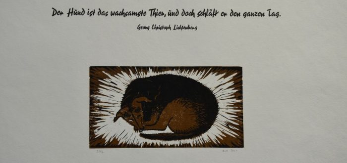
„Der Hund ist das wachsamste Thier“ broadsheet, woodcut from 2 blocks
Psalm 121, broadsheet,woodcut, on grey paper
„Der kleine Niak“, artist‘s book (out of print)
„Lushin“ portfolio
Contact:
For reading
Vladimir Nabokov „Lushins Verteidigung“, in Gesammelte Werke Band II – Frühe Romane 2, Rowohlt, 1992, Reinbek bei Hamburg
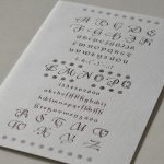
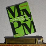
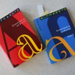
Georg Kandler: Alphabete – Erinnerungen an den Bleisatz, Band 2, 2001, Minner-Verlag, Kornwestheim.
D. H. Lawrence „Apocalypse“ Granada, 1981, London
To be continued on 27 March 2024


Really lovely. You’ve worked so hard on this big project. The photographs really bring the text to life.