The Studio in 2002
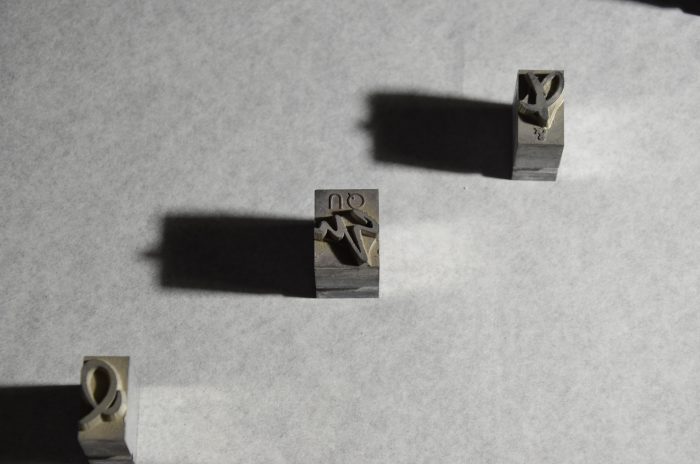
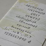
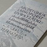
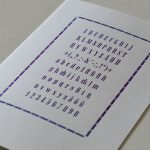
My husband and I continue to travel to Heiner Buser for casting our own type on his Monotype machines. Additionally there is more used metal type coming in, amongst it Reporter, a brush stroke style, Amati and more of Mistral. The latter counts as a script-and-brush style and is rather special. The lower case specimens are tricky to identify. The compositor has to work with the type upside down and it is always in mirror image. Composing is done on a composing stick which is adjusted to the chosen line length. To make working easier for the compositor in Mistral all lower case specimens come with a crib on the shoulder, telling which letter it is in a capital sans serif.
It is late October and we travel north to pick up cases with metal type at Peter‘s place in Oldenburg. We have planned to be on our way home on Sunday 27 October, but storm Jeanett has made landfall already in the northwest this very morning and it‘ll push eastward over Europe. On our way back home the storm will chase us, so we have to keep our rest breaks as short as possible. With a load of a few dozen cases full with metal type the van is quite heavy, but it also catches the gusts perfectly being what a colleague once called „a rolling wardrobe“.
We make it home half an hour before the storm hits. One of us quickly takes the dog for a walk, the other secures the windows. During this storm 47 people die across Europe, the damage caused is estimated at over 1 billion Euro. We and the type are unharmed.
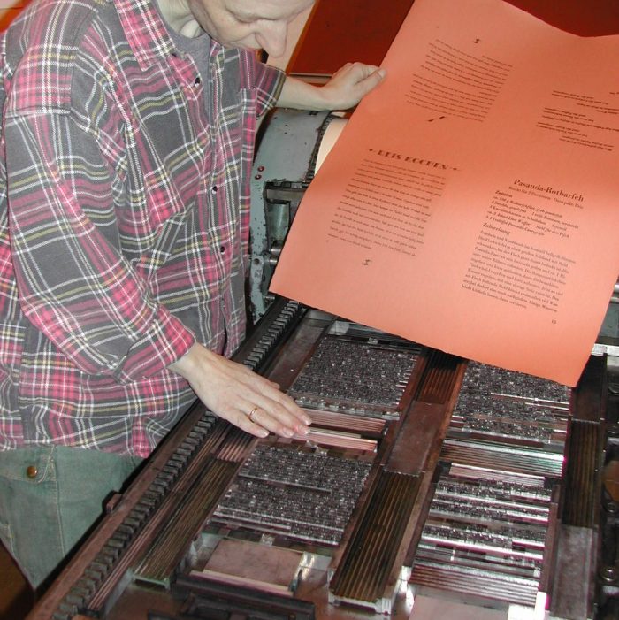
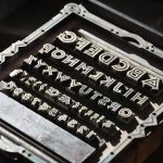
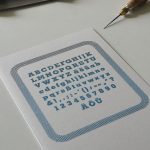
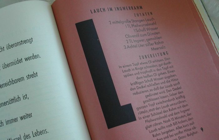
By now a reasonable number of typefaces have made themselves at home in the studio. Some older colleagues nudge me into printing a specimen book. In the olden days every printing office needed one, so clients could choose from the variety of typefaces on stock for whatever they wanted printed. This is how the second artist‘s book comes into being. The „Fernöstliche Schmausbuch“ is a typographic-philosophical collection of recipes. The maximum of typefaces from the studio‘s stock is used for the texts. A classical specimen book would show each typeface with all specimens plus a short text. The recipe book presents all typefaces in the form of either recipes or aphorisms. The majority of the recipes and wise sayings is East Asian, like a mix of curry and Confucius. They are printed on Zerkall deckled-edge paper in colours resembling ginger and cinnamon, it is a watermarked 90 gsm Ingres paper. Some 20 years later this particular papermill will be hit by the catastrophic flood in Ahrtal (Northrhine-Wetsphalia), as a result the production of deckled-edge paper is discontinued.
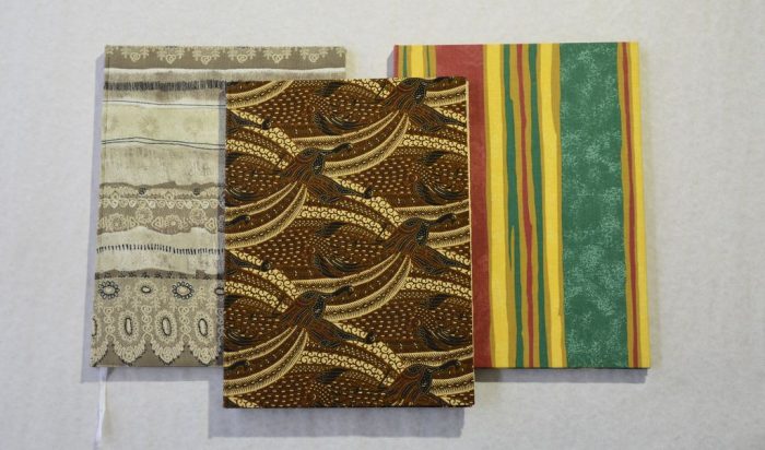
As cover material I choose fabric that links with the idea of the book and its contents: one fabric is in the colours of spices, one resembles a rug for an elephant and one shows peacocks, native to Asia.
Briefly noted:
Exhibiting at 4th Bookmakers‘ Fair in Mosbach
Work published in 2002:
„Auf dem Heimweg“ woodcut
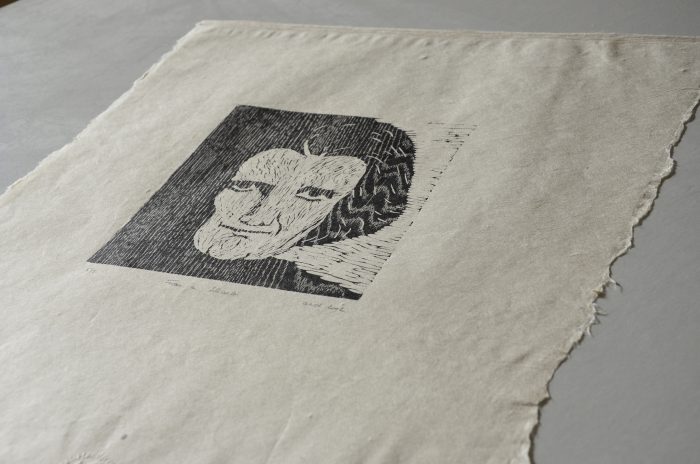
„Frau in Schwarz“ woodcut
„Herbst im Ries“ colour woodcut, 2 blocks
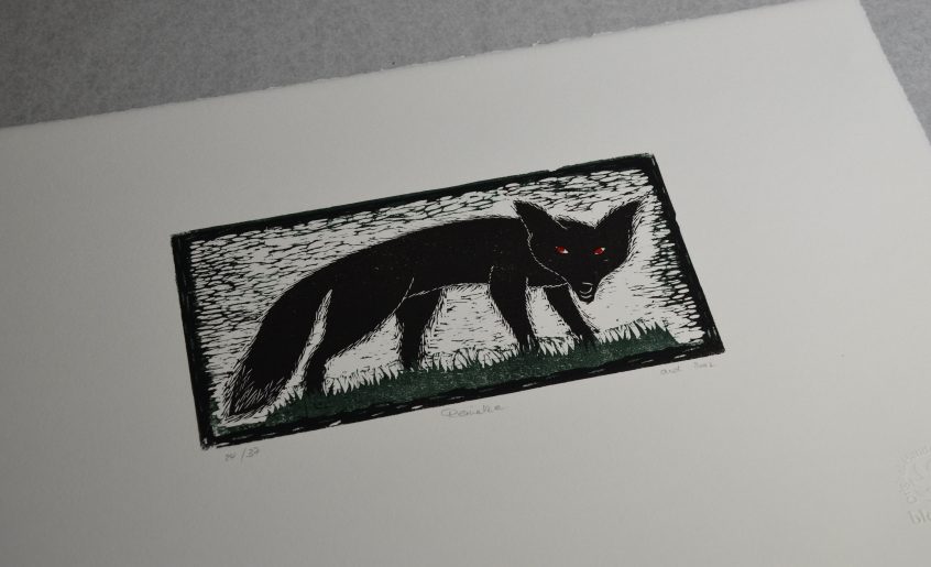
„Reineke“ colour woodcut, 3 blocks
„Zu zweit“ colour woodcut, 2 blocks
„Zauberperle“, broadsheet, poem on woodgrain burnished
Psalm 23, paper painted with earthen pigments prior to printing
„Fernöstliches Schmausbuch“ – typographic-philosophical collection of recipes (out of print)
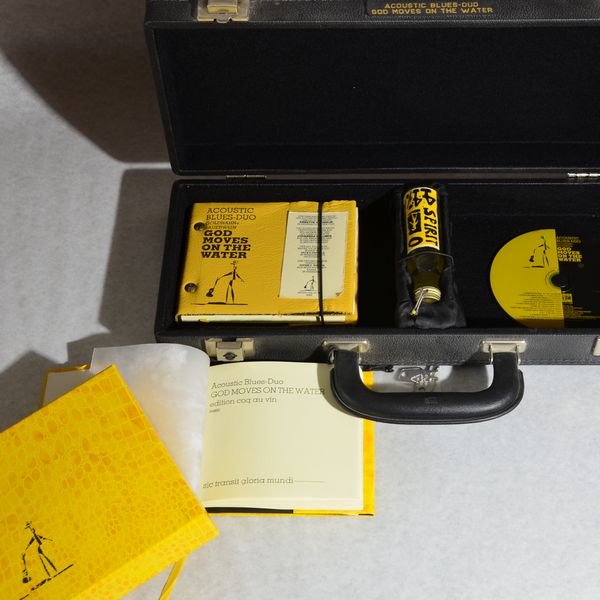
„God Moves On The Water“ – collaboration with Acoustic Blues Duo
Contact
To be continued on 30 March 2024


Another lovely blog posting. I really like the inclusion of the different samples of type font. You can be really proud of yourself.
Thanks Marianne. So glad you enjoy time travelling. Annette